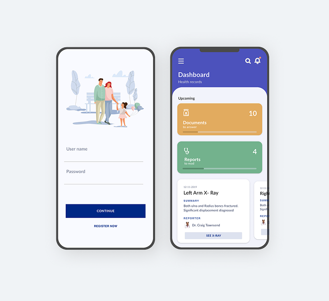
Overview
Emergency departments operate under immense pressure — information is fragmented, handoffs are error-prone, and families in waiting rooms receive little or no updates about their loved ones. Bloom is a design concept exploring how thoughtful UX can reduce cognitive load for clinicians while improving transparency for patients and families.
This was a Deloitte internal pitch: a team of designers making the case that good design in emergency care isn't a luxury — it's a patient safety issue.
The Challenge
Emergency triage systems are built around clinical logic, not human factors. The result is that clinicians must hold enormous amounts of information in working memory, handoffs between shifts introduce dangerous gaps, and families waiting outside constantly interrupt nurses for status updates — pulling attention away from care delivery.
"Designed for glanceability — because in an emergency department, a three-second read is sometimes all you get."
Design Highlights
-
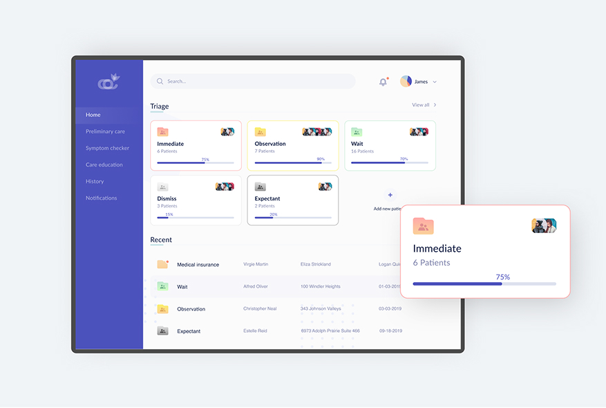
Real-time patient status board
At-a-glance triage priority view for the entire department — colour, shape, and position all carry meaning without relying on colour alone.
-
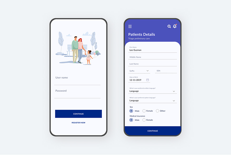
Smart triage intake
Clinical decision support built into the intake flow — surfacing relevant protocols based on presenting symptoms, not requiring recall.
-
Family-facing status updates
A separate view for waiting families reduces nurse interruptions by 30–50% in comparable pilot systems. Calm, plain-language updates on a wall display.
-
Shift handoff summaries
Auto-generated handoff notes reduce transcription errors and ensure continuity of care across team transitions.
Design Principles
Every primary screen is designed to be understood in under three seconds. Detail is one level deeper — always accessible, never default.
In a high-stress environment, decision fatigue costs lives. Each screen surfaces one clear action; everything else is secondary.
Screens are viewed in bright overhead lighting, often at a distance. Contrast ratios exceed WCAG AA at every level.
Information is sorted by urgency, not chronology. The most important thing is always in the same place.